Easily make nice per-group density and QQ plots
through a wrapper around the ggplot2 and qqplotr packages.
Usage
nice_normality(
  data,
  variable,
  group = NULL,
  colours,
  groups.labels,
  grid = TRUE,
  shapiro = FALSE,
  title = NULL,
  histogram = FALSE,
  breaks.auto = FALSE,
  ...
)
Arguments
- data
The data frame.
- variable
The dependent variable to be plotted.
- group
The group by which to plot the variable.
- colours
Desired colours for the plot, if desired.
- groups.labels
How to label the groups.
- grid
Logical, whether to keep the default background grid or not. APA style suggests not using a grid in the background, though in this case some may find it useful to more easily estimate the slopes of the different groups.
- shapiro
Logical, whether to include the p-value from the Shapiro-Wilk test on the plot.
- title
An optional title, if desired.
- histogram
Logical, whether to add an histogram on top of the density plot.
- breaks.auto
If histogram = TRUE, then option to set bins/breaks automatically, mimicking the default behaviour of base R
hist()(the Sturges method). Defaults toFALSE.- ...
Further arguments from
nice_qq()andnice_density()to be passed tonice_normality()
Value
A plot of classes patchwork and ggplot, containing two plots,
resulting from nice_density and nice_qq.
See also
Other functions useful in assumption testing:
nice_assumptions, nice_density,
nice_qq, nice_var,
nice_varplot. Tutorial:
https://rempsyc.remi-theriault.com/articles/assumptions
Examples
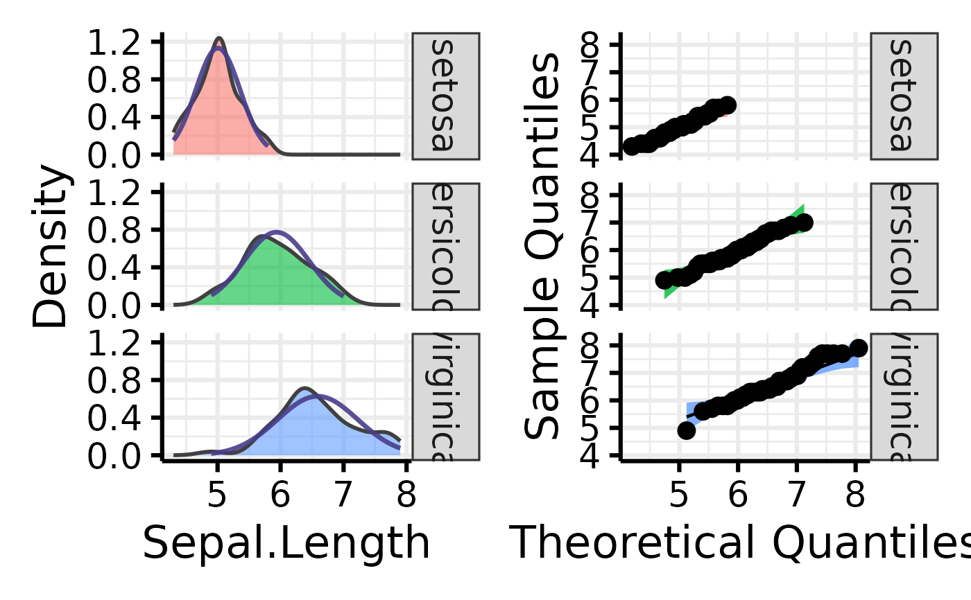
# Make the basic plot
nice_normality(
data = iris,
variable = "Sepal.Length",
group = "Species"
)
 # Further customization
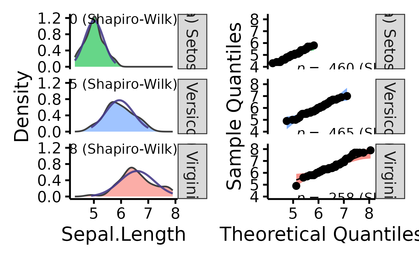
nice_normality(
data = iris,
variable = "Sepal.Length",
group = "Species",
colours = c(
"#00BA38",
"#619CFF",
"#F8766D"
),
groups.labels = c(
"(a) Setosa",
"(b) Versicolor",
"(c) Virginica"
),
grid = FALSE,
shapiro = TRUE
)
# Further customization
nice_normality(
data = iris,
variable = "Sepal.Length",
group = "Species",
colours = c(
"#00BA38",
"#619CFF",
"#F8766D"
),
groups.labels = c(
"(a) Setosa",
"(b) Versicolor",
"(c) Virginica"
),
grid = FALSE,
shapiro = TRUE
)