Make nice density plots easily. Internally, uses na.rm = TRUE.
Usage
nice_density(
  data,
  variable,
  group = NULL,
  colours,
  ytitle = "Density",
  xtitle = variable,
  groups.labels = NULL,
  grid = TRUE,
  shapiro = FALSE,
  title = variable,
  histogram = FALSE,
  breaks.auto = FALSE,
  bins = 30
)
Arguments
- data
The data frame
- variable
The dependent variable to be plotted.
- group
The group by which to plot the variable.
- colours
Desired colours for the plot, if desired.
- ytitle
An optional y-axis label, if desired.
- xtitle
An optional x-axis label, if desired.
- groups.labels
The groups.labels (might rename to
xlabelsfor consistency with other functions)- grid
Logical, whether to keep the default background grid or not. APA style suggests not using a grid in the background, though in this case some may find it useful to more easily estimate the slopes of the different groups.
- shapiro
Logical, whether to include the p-value from the Shapiro-Wilk test on the plot.
- title
The desired title of the plot. Can be put to
NULLto remove.- histogram
Logical, whether to add an histogram
- breaks.auto
If histogram = TRUE, then option to set bins/breaks automatically, mimicking the default behaviour of base R
hist()(the Sturges method). Defaults toFALSE.- bins
If
histogram = TRUE, then option to change the default bin (30).
Value
A density plot of class ggplot, by group (if provided), along a
reference line representing a matched normal distribution.
See also
Other functions useful in assumption testing:
nice_assumptions, nice_normality,
nice_qq, nice_varplot,
nice_var. Tutorial:
https://rempsyc.remi-theriault.com/articles/assumptions
Examples
# Make the basic plot
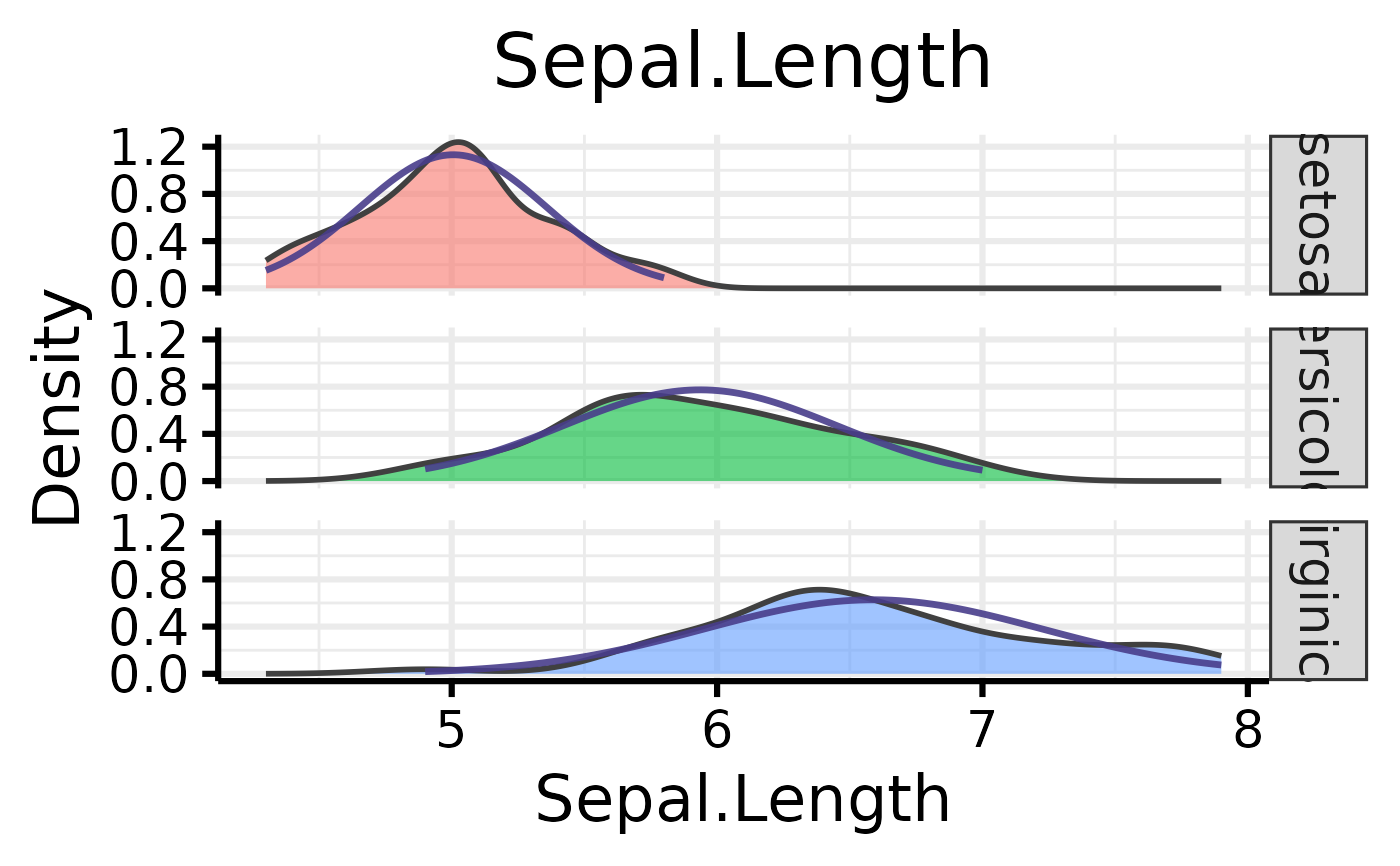
nice_density(
data = iris,
variable = "Sepal.Length",
group = "Species"
)
 # Further customization
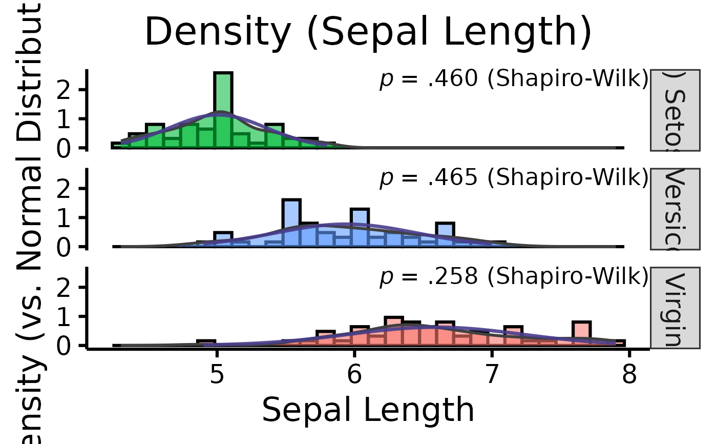
nice_density(
data = iris,
variable = "Sepal.Length",
group = "Species",
colours = c("#00BA38", "#619CFF", "#F8766D"),
xtitle = "Sepal Length",
ytitle = "Density (vs. Normal Distribution)",
groups.labels = c(
"(a) Setosa",
"(b) Versicolor",
"(c) Virginica"
),
grid = FALSE,
shapiro = TRUE,
title = "Density (Sepal Length)",
histogram = TRUE
)
# Further customization
nice_density(
data = iris,
variable = "Sepal.Length",
group = "Species",
colours = c("#00BA38", "#619CFF", "#F8766D"),
xtitle = "Sepal Length",
ytitle = "Density (vs. Normal Distribution)",
groups.labels = c(
"(a) Setosa",
"(b) Versicolor",
"(c) Virginica"
),
grid = FALSE,
shapiro = TRUE,
title = "Density (Sepal Length)",
histogram = TRUE
)