Easy scatter plots over multiple times (T1, T2, T3)
Source:R/plot_means_over_time.R
plot_means_over_time.RdMake nice scatter plots over multiple times (T1, T2, T3) easily.
Usage
plot_means_over_time(
  data,
  response,
  group,
  groups.order = "none",
  ci_type = "within",
  error_bars = TRUE,
  ytitle = NULL,
  legend.title = "",
  legend.position = "right",
  significance_stars,
  significance_stars_x,
  significance_stars_y,
  significance_bars_x,
  line_width = 3,
  point_size = 4,
  facet = NULL,
  facets.order = "none",
  print_table = FALSE,
  verbose = FALSE
)
Arguments
- data
The data frame.
- response
The dependent variable to be plotted (e.g.,
c("variable_T1", "variable_T2", "variable_T3"), etc.).- group
The group by which to plot the variable
- groups.order
Specifies the desired display order of the groups on the legend. Either provide the levels directly, or a string: "increasing" or "decreasing", to order based on the average value of the variable on the y axis, or "string.length", to order from the shortest to the longest string (useful when working with long string names). "Defaults to "none".
- ci_type
Character string specifying the type of confidence interval to use. Options are
"within"(default) for within-subject adjusted CIs using the Morey (2008) correction, or"between"for regular between-subject CIs. Use"between"for simulated data or non-repeated-measures designs.- error_bars
Logical, whether to include 95% confidence intervals for means.
- ytitle
An optional x-axis label, if desired. If
NULL, will take the variable name of the first variable inresponse, and keep only the part of the string before an underscore or period.- legend.title
The desired legend title.
- legend.position
The position of the legend. Can be "right" (default), "left", "top", "bottom", or "none" to hide the legend. Useful for positioning the legend at the bottom for very wide figures.
- significance_stars
Vetor of significance stars to display on the plot (e.g,.
c("*", "**", "***")).- significance_stars_x
Vector of where on the x-axis significance stars should appear on the plot (e.g.,
c(2.2, 3.2, 4.2)).- significance_stars_y
Vector of where on the y-axis significance stars should appear on the plot. The logic here is different than previous arguments. Rather than providing actual coordinates, we provide a list object with structure group 1, group 2, and time of comparison, e.g.,
list(c("group1", "group2", time = 2), c("group1", "group3", time = 3), c("group2", "group3", time = 4)).- significance_bars_x
Vector of where on the x-axis vertical significance bars should appear on the plot (e.g.,
c(2:4)).- line_width
Numeric. Line thickness used in
geom_line(). Defaults to 3. Can be reduced for publication figures or increased for presentation slides.- point_size
Numeric. Point size used in
geom_point(). Defaults to 4. Adjust to improve readability depending on output format.- facet
The variable by which to facet grid.
- facets.order
Specifies the desired display order of facet panels. Either provide the levels directly, or a string: "increasing" or "decreasing", to order panels based on the average value of the y variable, or "string.length" to order panels by facet label length. Defaults to "none".
- print_table
Logical, whether to also print the computed table.
- verbose
Logical, whether to also print a note regarding the meaning of the error bars.
Details
By default, error bars are calculated using the method of Morey (2008)
through Rmisc::summarySEwithin(), but raw means are plotted instead of the
normed means. For more information, visit:
http://www.cookbook-r.com/Graphs/Plotting_means_and_error_bars_(ggplot2).
Use ci_type = "between" for regular (between-subject) confidence intervals
when working with simulated data or non-repeated-measures designs.
References
Morey, R. D. (2008). Confidence intervals from normalized data: A correction to Cousineau (2005). Tutorials in Quantitative Methods for Psychology, 4(2), 61-64. doi:10.20982/tqmp.04.2.p061
Examples
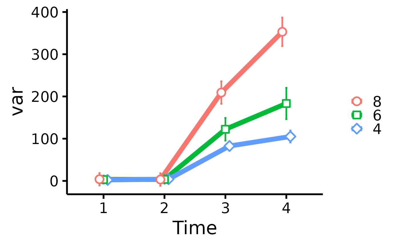
data <- mtcars
names(data)[6:3] <- paste0("T", 1:4, "_var")
plot_means_over_time(
data = data,
response = names(data)[6:3],
group = "cyl",
groups.order = "decreasing",
facet = "am"
)
#> Automatically converting the following non-factors to factors: am
 # Add significance stars/bars
plot_means_over_time(
data = data,
response = names(data)[6:3],
group = "cyl",
significance_bars_x = c(3.15, 4.15),
significance_stars = c("*", "***"),
significance_stars_x = c(3.25, 4.5),
significance_stars_y = list(
c("4", "8", time = 3),
c("4", "8", time = 4)
)
)
# Add significance stars/bars
plot_means_over_time(
data = data,
response = names(data)[6:3],
group = "cyl",
significance_bars_x = c(3.15, 4.15),
significance_stars = c("*", "***"),
significance_stars_x = c(3.25, 4.5),
significance_stars_y = list(
c("4", "8", time = 3),
c("4", "8", time = 4)
)
)
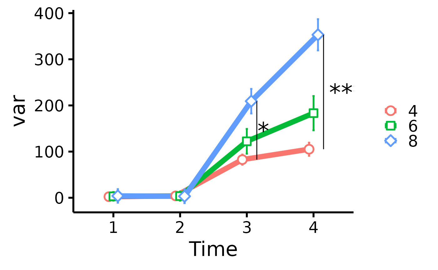 # significance_stars_y: List with structure: list(c("group1", "group2", time))