Make nice violin plots easily with 95% (possibly bootstrapped) confidence intervals.
Usage
nice_violin(
  data,
  response,
  group = NULL,
  boot = FALSE,
  bootstraps = 2000,
  colours,
  xlabels = NULL,
  ytitle = response,
  xtitle = NULL,
  has.ylabels = TRUE,
  has.xlabels = TRUE,
  comp1 = 1,
  comp2 = 2,
  signif_annotation = NULL,
  signif_yposition = NULL,
  signif_xmin = NULL,
  signif_xmax = NULL,
  ymin,
  ymax,
  yby = 1,
  CIcap.width = 0.1,
  obs = FALSE,
  alpha = 1,
  border.colour = "black",
  border.size = 2,
  has.d = FALSE,
  d.x = mean(c(comp1, comp2)) * 1.1,
  d.y = mean(data[[response]]) * 1.3,
  groups.order = "none",
  xlabels.angle = 0
)
Arguments
- data
The data frame.
- response
The dependent variable to be plotted.
- group
The group by which to plot the variable.
- boot
Logical, whether to use bootstrapping for the confidence interval or not.
- bootstraps
How many bootstraps to use.
- colours
Desired colours for the plot, if desired.
- xlabels
The individual group labels on the x-axis.
- ytitle
An optional y-axis label, if desired.
- xtitle
An optional x-axis label, if desired.
- has.ylabels
Logical, whether the x-axis should have labels or not.
- has.xlabels
Logical, whether the y-axis should have labels or not.
- comp1
The first unit of a pairwise comparison, if the goal is to compare two groups. Automatically displays
*,**, or***depending on significance of the difference. Can take either a numeric value (based on the group number) or the name of the group directly. Must be provided along with argumentcomp2.- comp2
The second unit of a pairwise comparison, if the goal is to compare two groups. Automatically displays "", "", or "" depending on significance of the difference. Can take either a numeric value (based on the group number) or the name of the group directly. Must be provided along with argument
comp1.- signif_annotation
Manually provide the required annotations/numbers of stars (as character strings). Useful if the automatic pairwise comparison annotation does not work as expected, or yet if one wants more than one pairwise comparison. Must be provided along with arguments
signif_yposition,signif_xmin, andsignif_xmax.- signif_yposition
Manually provide the vertical position of the annotations/stars, based on the y-scale.
- signif_xmin
Manually provide the first part of the horizontal position of the annotations/stars (start of the left-sided bracket), based on the x-scale.
- signif_xmax
Manually provide the second part of the horizontal position of the annotations/stars (end of the right-sided bracket), based on the x-scale.
- ymin
The minimum score on the y-axis scale.
- ymax
The maximum score on the y-axis scale.
- yby
How much to increase on each "tick" on the y-axis scale.
- CIcap.width
The width of the confidence interval cap.
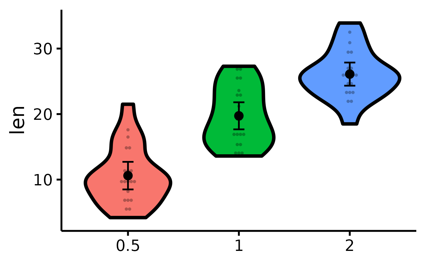
- obs
Logical, whether to plot individual observations or not. The type of plotting can also be specified, either
"dotplot"(same asobs = TRUEfor backward compatibility) or"jitter", useful when there are a lot of observations.- alpha
The transparency of the plot.
- border.colour
The colour of the violins border.
- border.size
The size of the violins border.
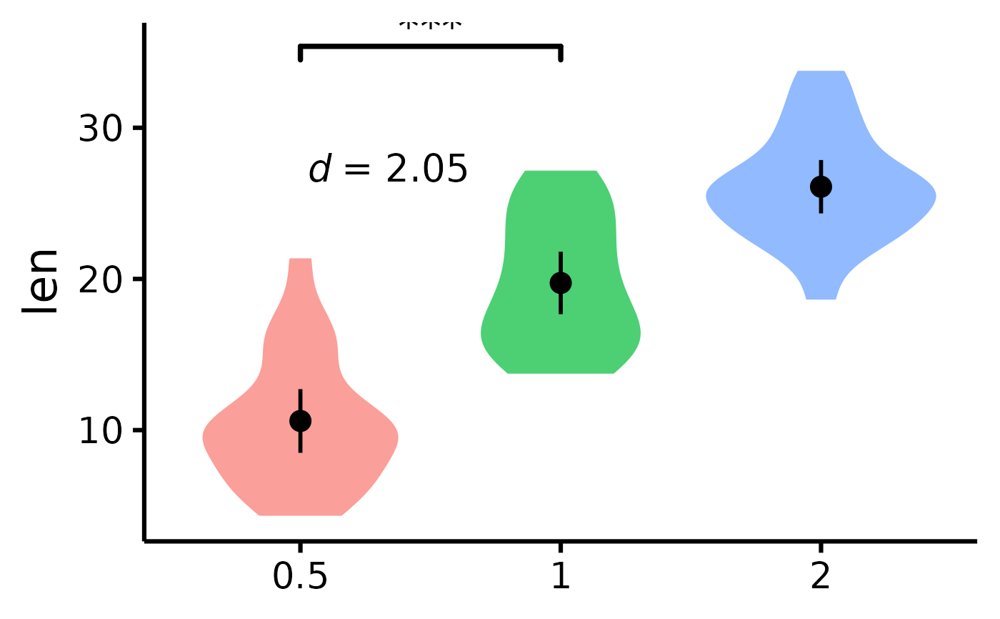
- has.d
Whether to display the d-value.
- d.x
The x-axis coordinates for the d-value.
- d.y
The y-axis coordinates for the d-value.
- groups.order
How to order the group factor levels on the x-axis. Either "increasing" or "decreasing", to order based on the value of the variable on the y axis, or "string.length", to order from the shortest to the longest string (useful when working with long string names). "Defaults to "none".
- xlabels.angle
How much to tilt the labels of the x-axis. Useful when working with long string names. "Defaults to 0.
Details
Using boot = TRUE uses bootstrapping (for the
confidence intervals only) with the BCa method, using
the rcompanion_groupwiseMean function.
For the easystats equivalent, see: see::geom_violindot().
See also
Visualize group differences via scatter plots:
nice_scatter. Tutorial:
https://rempsyc.remi-theriault.com/articles/violin
Examples
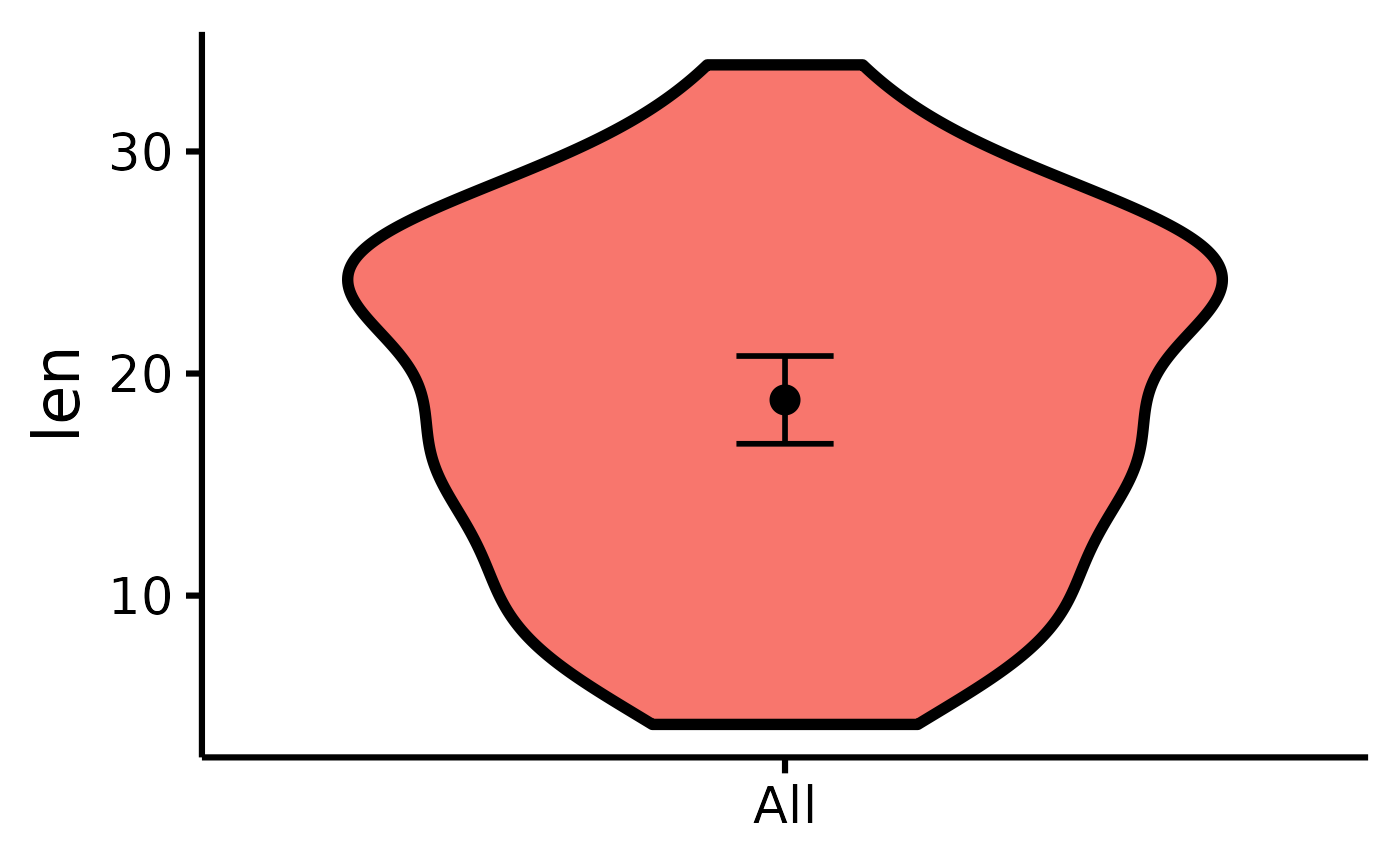
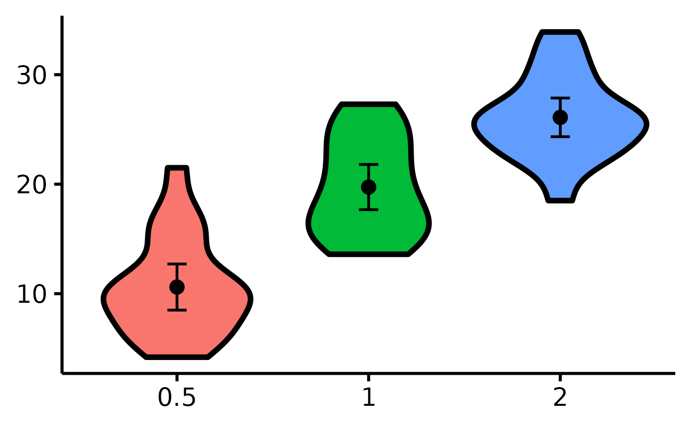
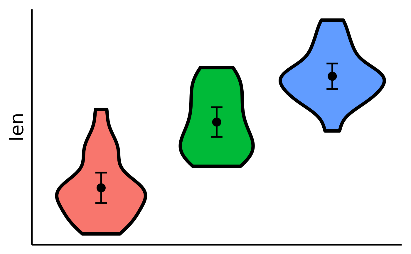
# Make the basic plot
nice_violin(
data = ToothGrowth,
response = "len"
)
 # \donttest{
# Save a high-resolution image file to specified directory
ggplot2::ggsave("niceviolinplothere.pdf", width = 7,
height = 7, unit = "in", dpi = 300
) # change for your own desired path
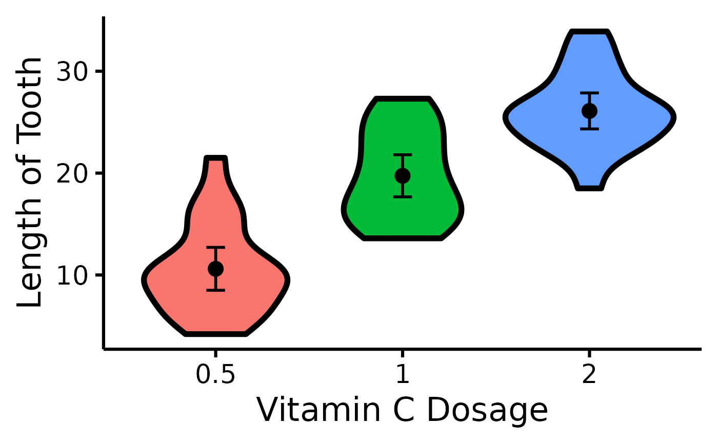
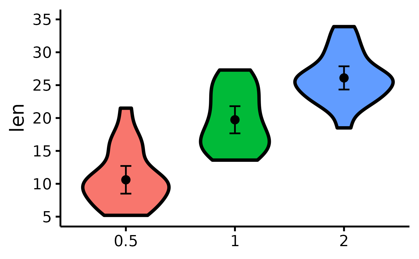
# Change x- and y- axes labels
nice_violin(
data = ToothGrowth,
group = "dose",
response = "len",
ytitle = "Length of Tooth",
xtitle = "Vitamin C Dosage"
)
# \donttest{
# Save a high-resolution image file to specified directory
ggplot2::ggsave("niceviolinplothere.pdf", width = 7,
height = 7, unit = "in", dpi = 300
) # change for your own desired path
# Change x- and y- axes labels
nice_violin(
data = ToothGrowth,
group = "dose",
response = "len",
ytitle = "Length of Tooth",
xtitle = "Vitamin C Dosage"
)
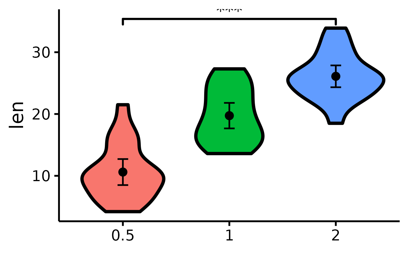
 # See difference between two groups
nice_violin(
data = ToothGrowth,
group = "dose",
response = "len",
comp1 = "0.5",
comp2 = "2"
)
# See difference between two groups
nice_violin(
data = ToothGrowth,
group = "dose",
response = "len",
comp1 = "0.5",
comp2 = "2"
)
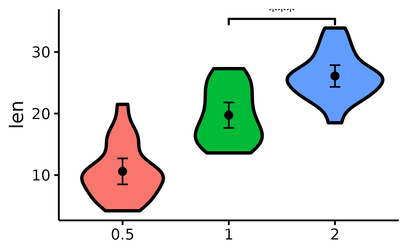
 nice_violin(
data = ToothGrowth,
group = "dose",
response = "len",
comp1 = 2,
comp2 = 3
)
nice_violin(
data = ToothGrowth,
group = "dose",
response = "len",
comp1 = 2,
comp2 = 3
)
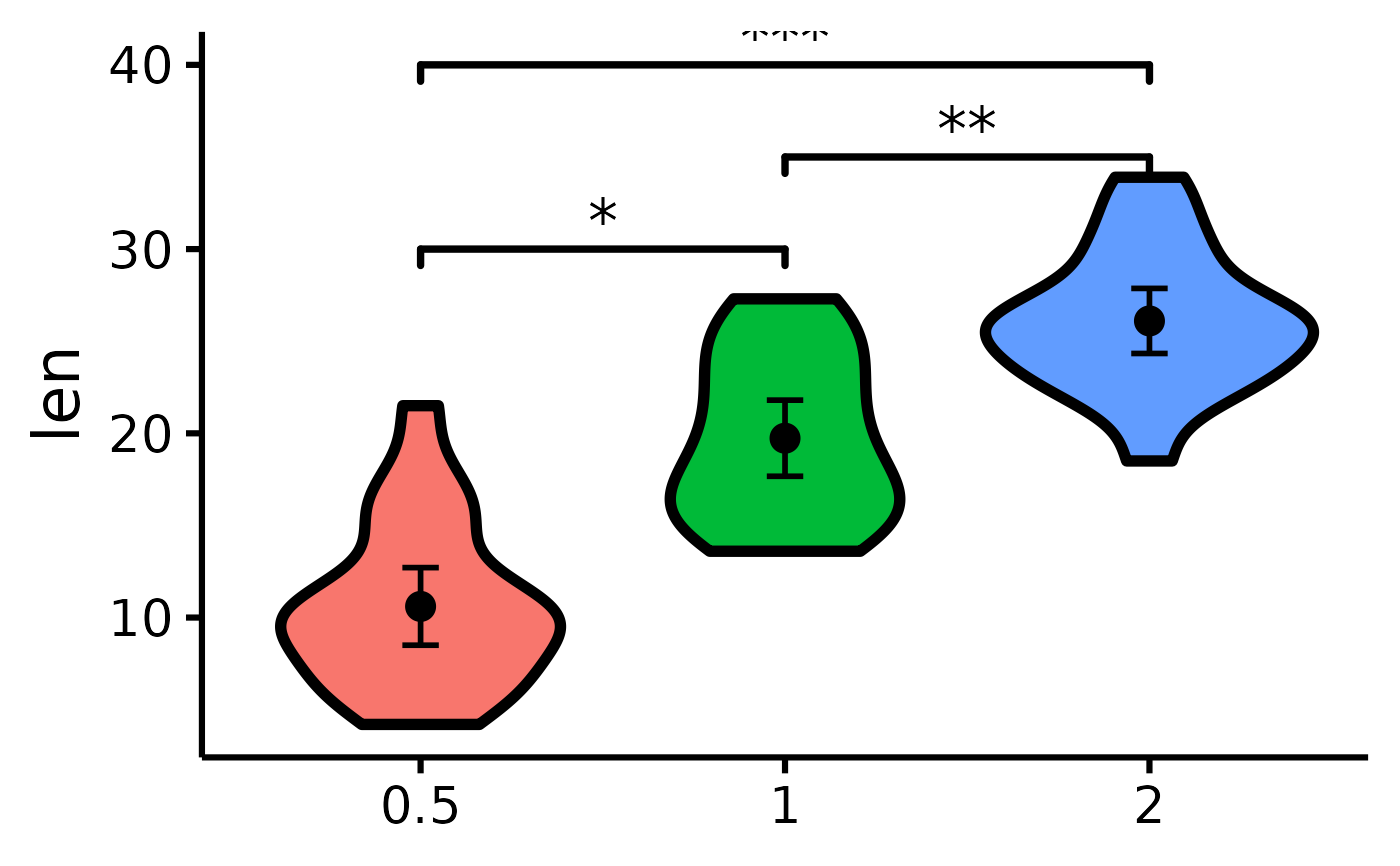
 # Compare all three groups
nice_violin(
data = ToothGrowth,
group = "dose",
response = "len",
signif_annotation = c("*", "**", "***"),
# manually enter the number of stars
signif_yposition = c(30, 35, 40),
# What height (y) should the stars appear
signif_xmin = c(1, 2, 1),
# Where should the left-sided brackets start (x)
signif_xmax = c(2, 3, 3)
)
# Compare all three groups
nice_violin(
data = ToothGrowth,
group = "dose",
response = "len",
signif_annotation = c("*", "**", "***"),
# manually enter the number of stars
signif_yposition = c(30, 35, 40),
# What height (y) should the stars appear
signif_xmin = c(1, 2, 1),
# Where should the left-sided brackets start (x)
signif_xmax = c(2, 3, 3)
)
 # Where should the right-sided brackets end (x)
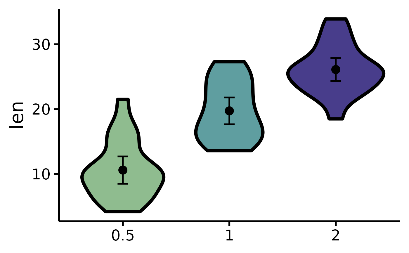
# Set the colours manually
nice_violin(
data = ToothGrowth,
group = "dose",
response = "len",
colours = c("darkseagreen", "cadetblue", "darkslateblue")
)
# Where should the right-sided brackets end (x)
# Set the colours manually
nice_violin(
data = ToothGrowth,
group = "dose",
response = "len",
colours = c("darkseagreen", "cadetblue", "darkslateblue")
)
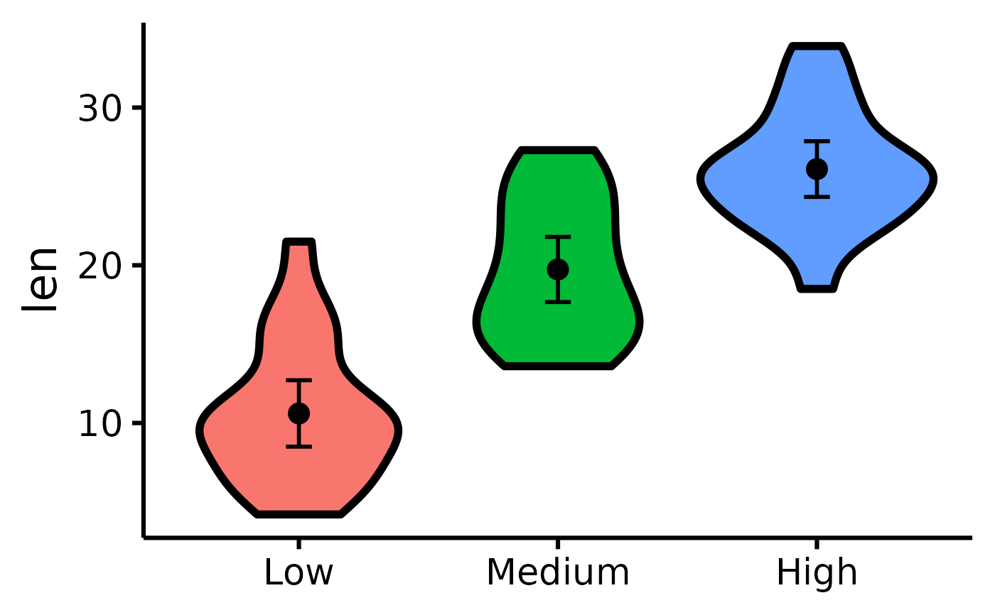
 # Changing the names of the x-axis labels
nice_violin(
data = ToothGrowth,
group = "dose",
response = "len",
xlabels = c("Low", "Medium", "High")
)
# Changing the names of the x-axis labels
nice_violin(
data = ToothGrowth,
group = "dose",
response = "len",
xlabels = c("Low", "Medium", "High")
)
 # Removing the x-axis or y-axis titles
nice_violin(
data = ToothGrowth,
group = "dose",
response = "len",
ytitle = NULL,
xtitle = NULL
)
# Removing the x-axis or y-axis titles
nice_violin(
data = ToothGrowth,
group = "dose",
response = "len",
ytitle = NULL,
xtitle = NULL
)
 # Removing the x-axis or y-axis labels (for whatever purpose)
nice_violin(
data = ToothGrowth,
group = "dose",
response = "len",
has.ylabels = FALSE,
has.xlabels = FALSE
)
# Removing the x-axis or y-axis labels (for whatever purpose)
nice_violin(
data = ToothGrowth,
group = "dose",
response = "len",
has.ylabels = FALSE,
has.xlabels = FALSE
)
 # Set y-scale manually
nice_violin(
data = ToothGrowth,
group = "dose",
response = "len",
ymin = 5,
ymax = 35,
yby = 5
)
#> Warning: Removed 1 row containing non-finite outside the scale range
#> (`stat_ydensity()`).
# Set y-scale manually
nice_violin(
data = ToothGrowth,
group = "dose",
response = "len",
ymin = 5,
ymax = 35,
yby = 5
)
#> Warning: Removed 1 row containing non-finite outside the scale range
#> (`stat_ydensity()`).
 # Plotting individual observations
nice_violin(
data = ToothGrowth,
group = "dose",
response = "len",
obs = TRUE
)
#> Bin width defaults to 1/30 of the range of the data. Pick better value with
#> `binwidth`.
# Plotting individual observations
nice_violin(
data = ToothGrowth,
group = "dose",
response = "len",
obs = TRUE
)
#> Bin width defaults to 1/30 of the range of the data. Pick better value with
#> `binwidth`.
 # Micro-customizations
nice_violin(
data = ToothGrowth,
group = "dose",
response = "len",
CIcap.width = 0,
alpha = .70,
border.size = 1,
border.colour = "white",
comp1 = 1,
comp2 = 2,
has.d = TRUE
)
# Micro-customizations
nice_violin(
data = ToothGrowth,
group = "dose",
response = "len",
CIcap.width = 0,
alpha = .70,
border.size = 1,
border.colour = "white",
comp1 = 1,
comp2 = 2,
has.d = TRUE
)
 # }
# }