Easy grouped bar charts for categorical variables
Source:R/grouped_bar_chart.R
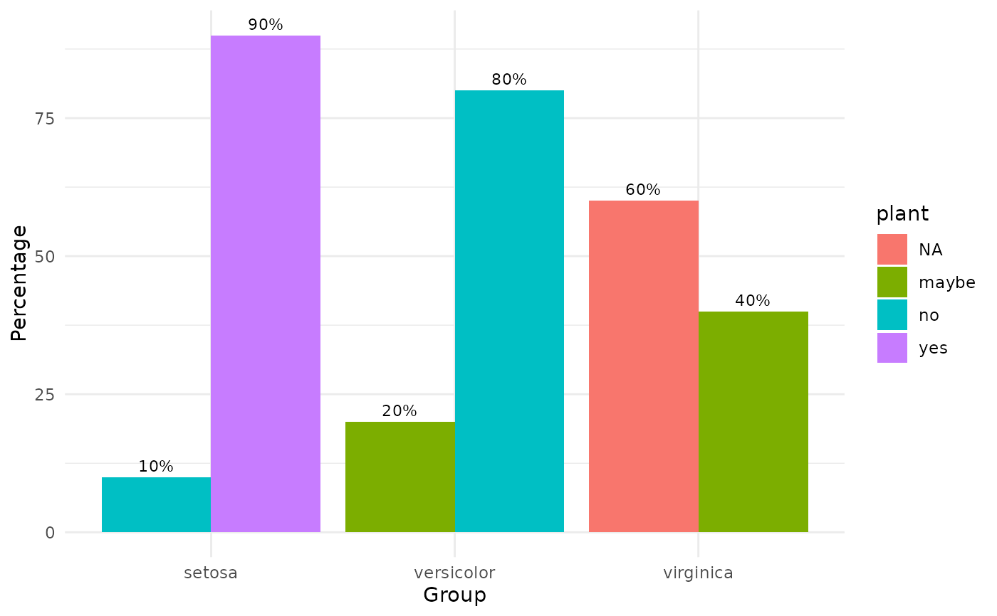
grouped_bar_chart.RdMake nice grouped bar charts easily.
Usage
grouped_bar_chart(
  data,
  response,
  label = response,
  group = "T1_Group",
  proportion = TRUE,
  print_table = FALSE
)
Arguments
- data
The data frame.
- response
The categorical dependent variable to be plotted.
- label
Label of legend describing the dependent variable.
- group
The group by which to plot the variable
- proportion
Logical, whether to use proportion (default), else, counts.
- print_table
Logical, whether to also print the computed proportion or count table.